Kroger Frozen Chicken
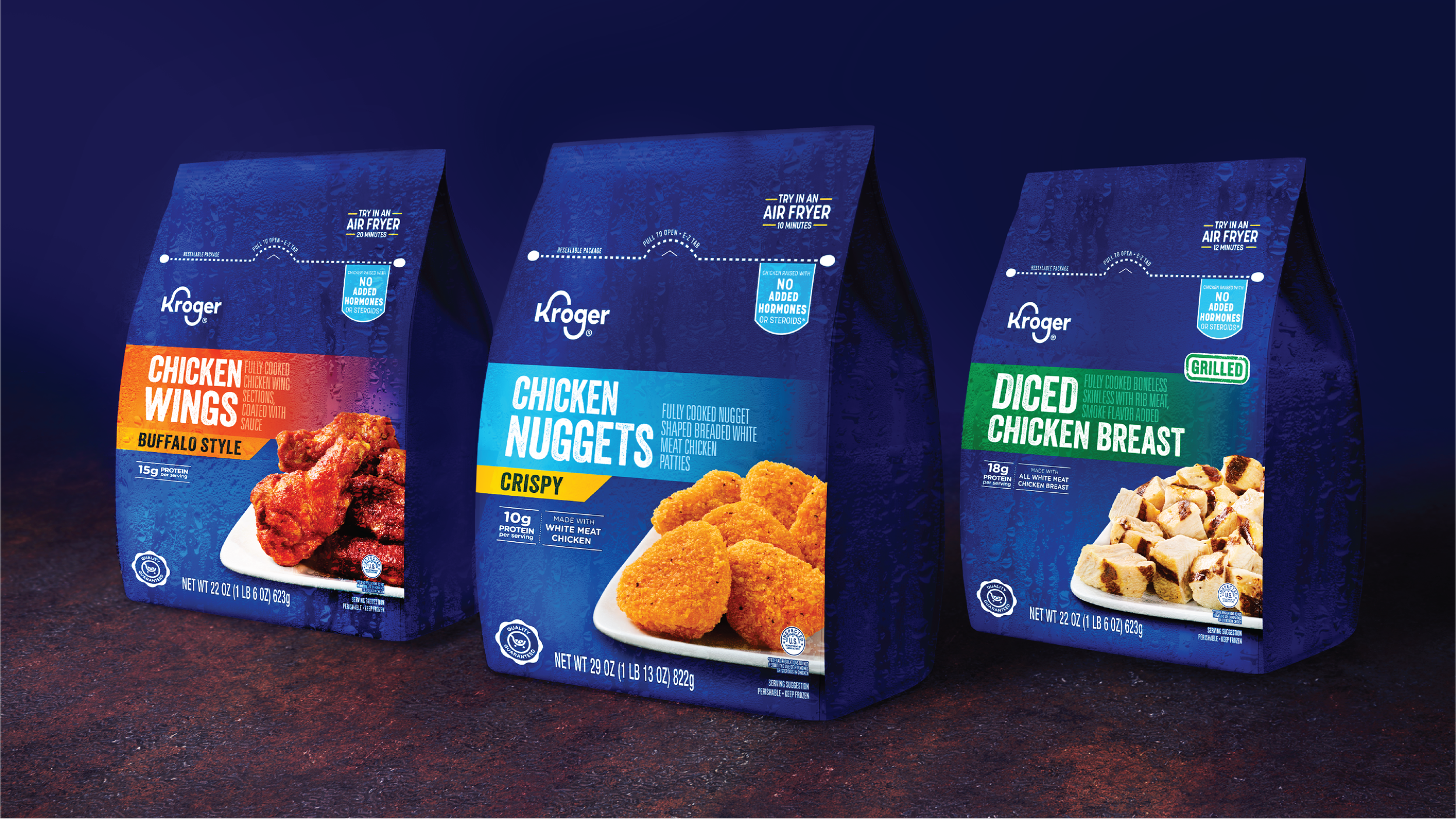
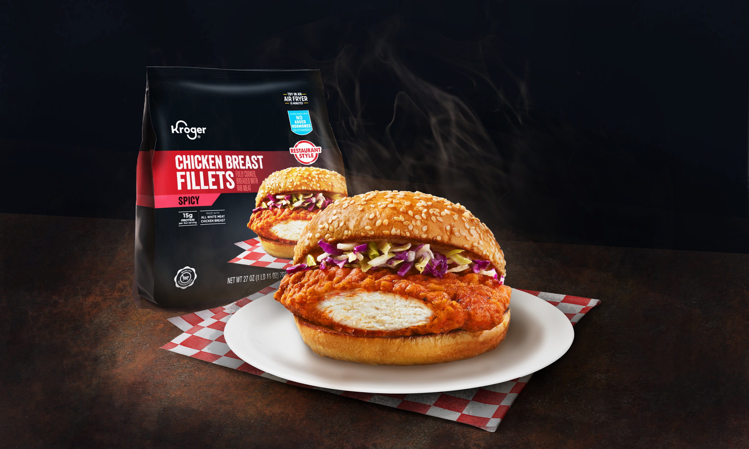
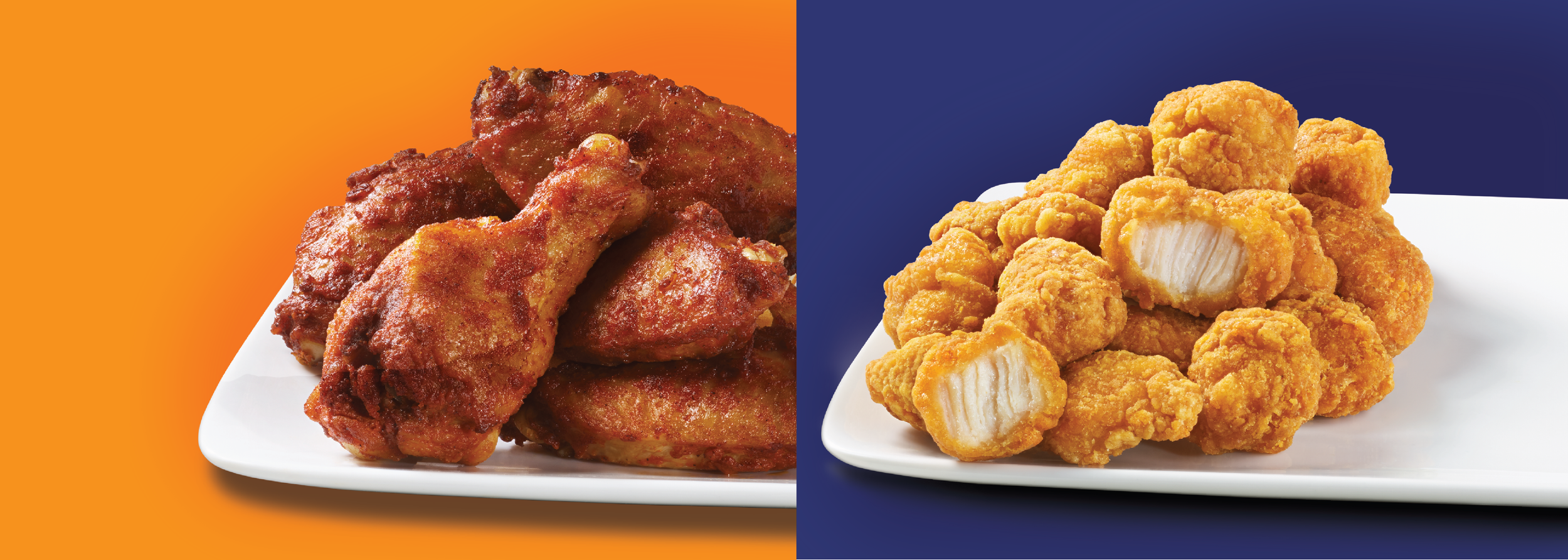
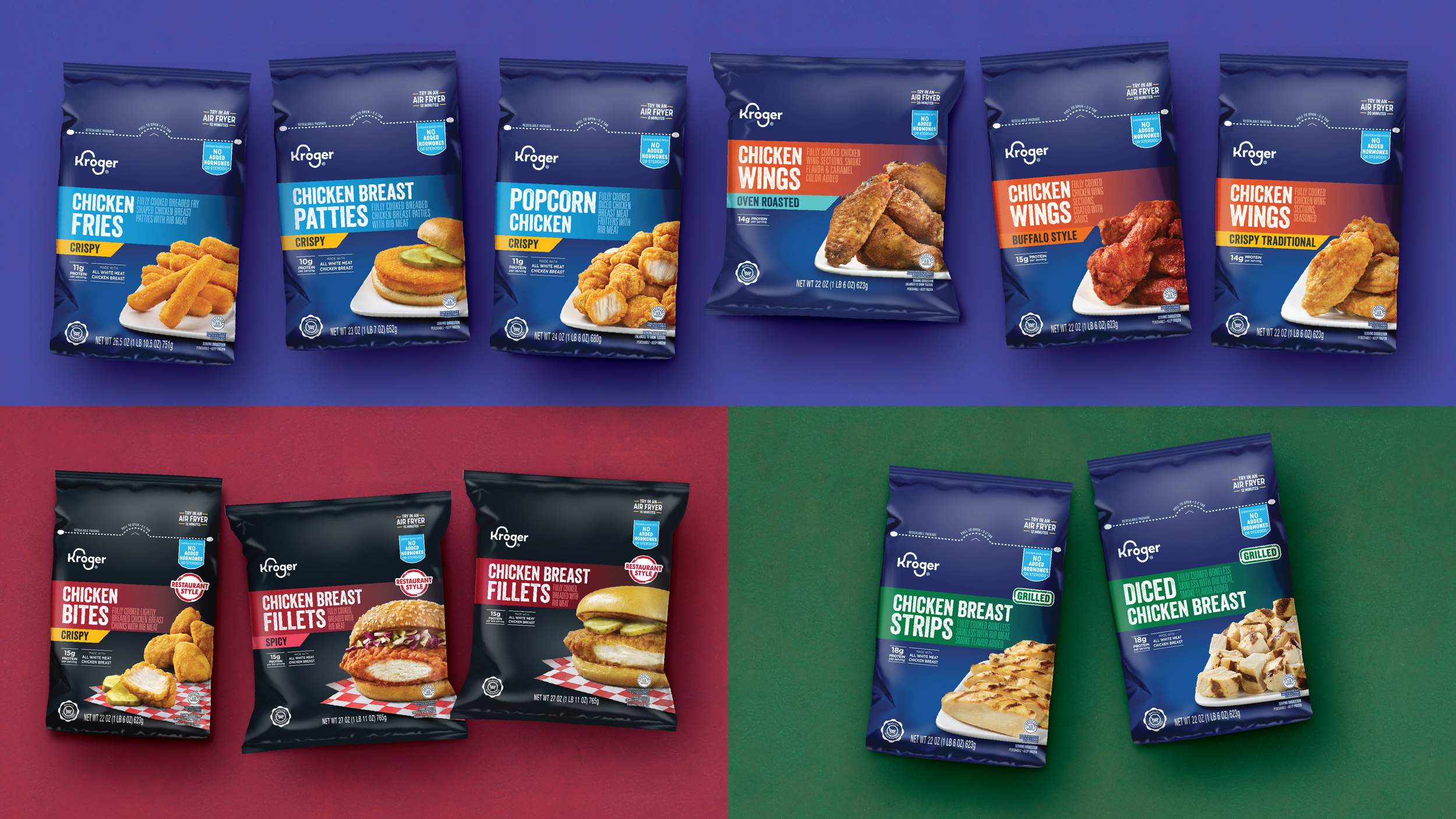
A refreshed and consistent packaging system built for clarity in a crowded freezer aisle. Appetite appeal leads the design, while Kroger’s recognizable blue for their core line supports a strong visual hierarchy. With over 30 SKUs, the system makes product types and flavors easy to navigate while maintaining a confident, elevated shelf presence.
Summary
Role
Designer and Art Director @ Design Resource Center // Packaging Design
Key Insight
To stand out against national brands while holding a rigid system, appetite appeal had to work hard. Giving food photography visual priority through scale, lighting, and placement allows the product type to read quickly, while strong hierarchy and color segmentation keep a large SKU set organized and cohesive.